Turn your customers into success stories with built-in intelligence featuring state of the art analytics, dashboards and more.
Overview
Solutions for Your Business see how businesses like yours use Bold BI to drive better decision-making. Browse by industry, department, or data analytics. In your own data, find answers to some of your most pressing business challenges.
⏰Project Timeline: May 2018 - May 2019 🎩Role - User Experience Designer 👥Team: 5 peeps
Step 1 - Heuristic Evaluation on the current system
Prepared multiple heuristic evaluations and logged in Confluence. This task helped us in identifying current problems and weak spots where we missed to focus and where we lacked usability importance.
Step 2 - User Studies
Asked a sample user group to perform a simple task while observing them to identify where an ideal user would have trouble and need help to proceed further. This study is recorded for further analysis.
Step 3 - stakeholders Meeting
Had direct interactions with engineers to clearly understand all current modules, it's flow, purpose, inputs needed, use cases etc..
Had individual sessions, explaining all widget properties and contextual dialogs from WPF and Web designers.
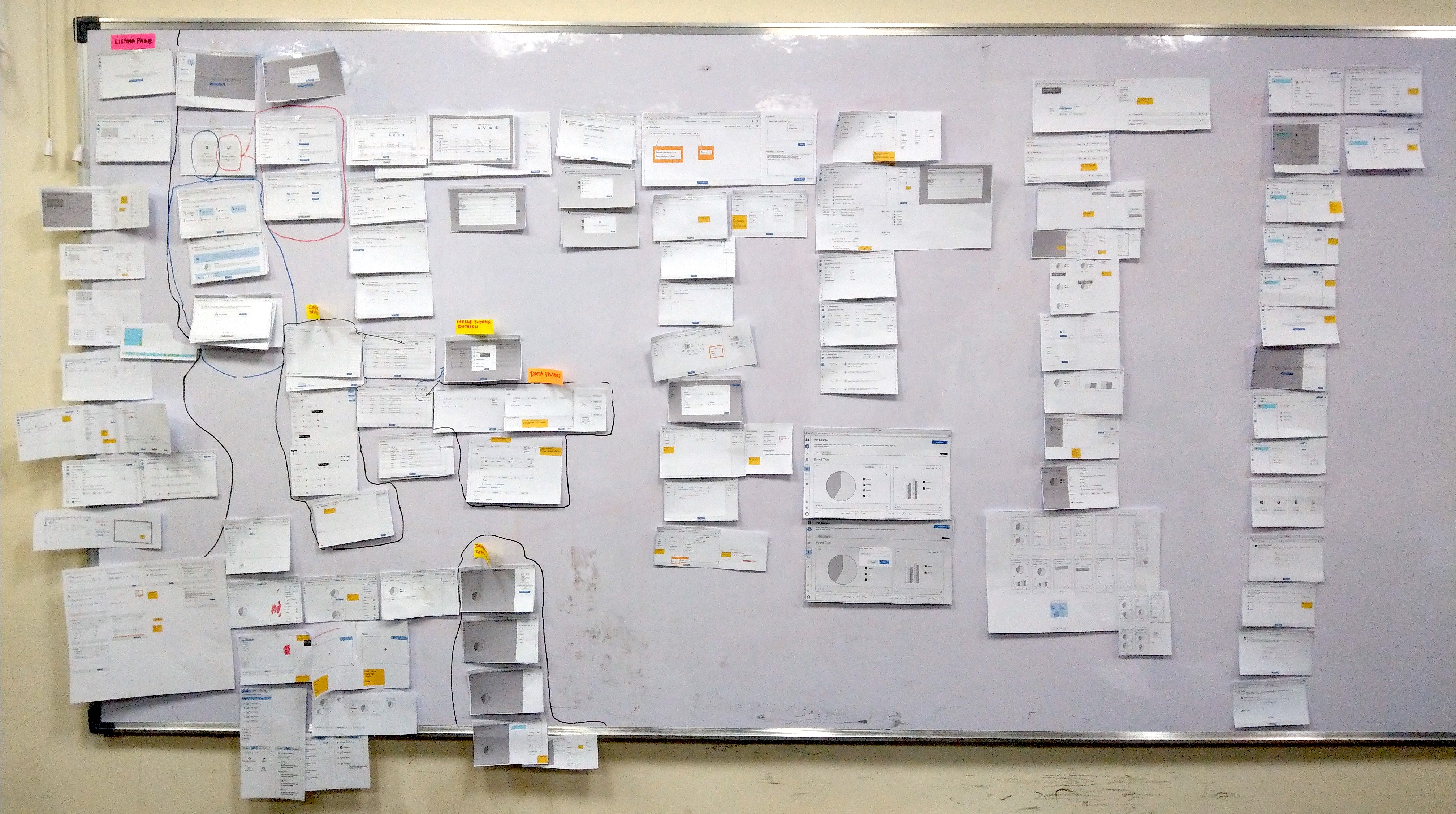
Step 4 - Competitor Analysis
Shortlisted 7 competitors event we found many related products online as we looked. Starting from Sign-up to Collaborate, used all apps and analyzed each step they have used to understand how they guide a new user, what help is provided, simplicity and features provided for building a dashboard.
•
Google Data Studio
•
Databox
•
SiSense
•
PowerBI
•
Tableau
•
Klipfolio
•
Slemma
All these apps are used on private networks with dummy credentials we use for UX research. No official details or names are used.
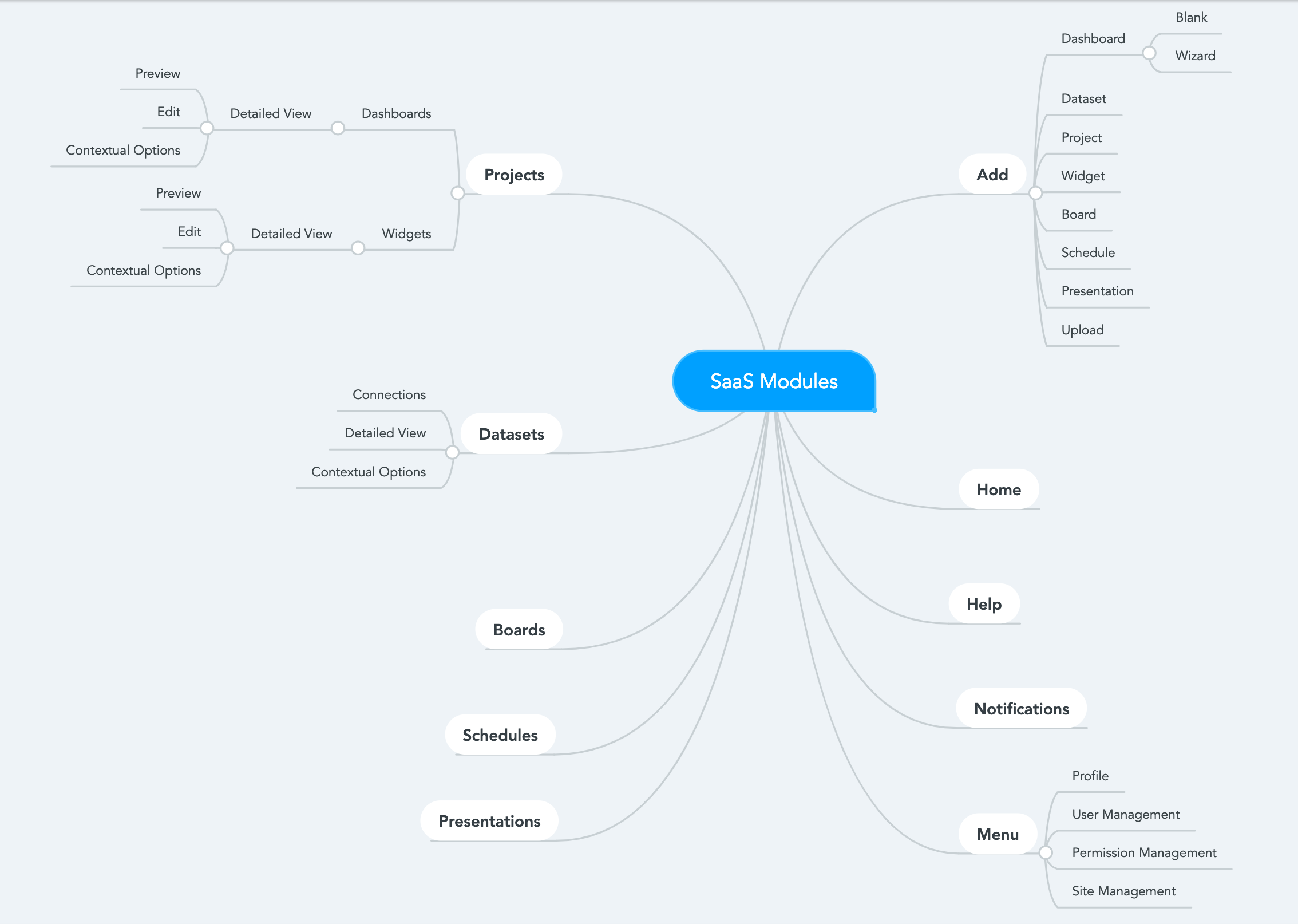
Step 5 - Mindmap
With all random information, we formulated a mind tree. This was used to group information, identify features, form task flows etc...
Step 6 - Feature / Module Analysis
All modules are broken down and analyzed and documented along with competitors screenshots and notes. This was then used in discussions to formulate IA and Wireframe.
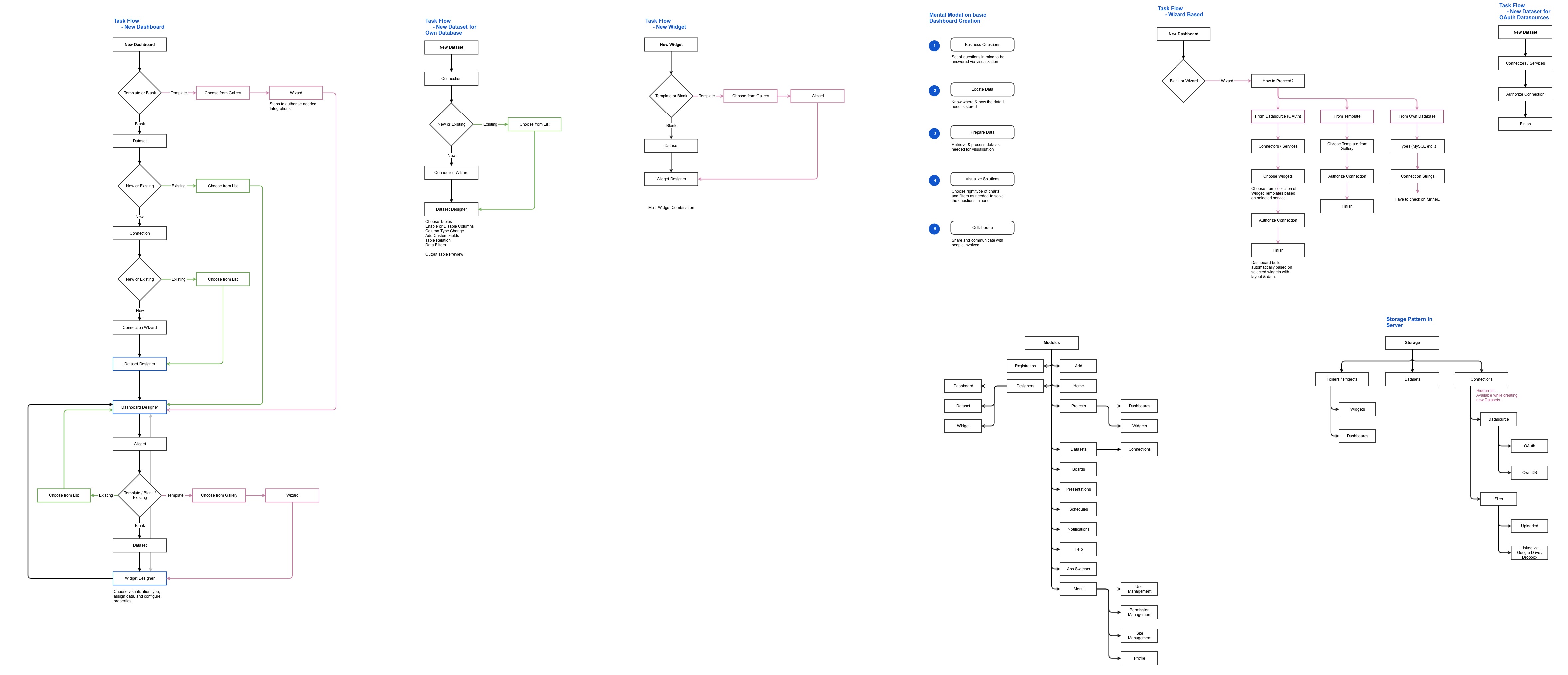
Step 7 - Taskflows
Defined a Task flow to go with after discussing multiple flows and architectures derived from the above processes.
Step 8 - Brainstorm Discussions
Had multiple discussions for each module with the team. Help us to find new ideas and refine them to our needs, gain more insight, solve problems, come up with better usability solutions, define feature grouping and hierarchy etc..
Design goals
•
To create a interaction with the ethonologic approach
•
The user should get the most comfortable experience through out the usage
•
The user should also find the most complex routes
Step 9 - Sitemaps
To start planning the way the screens are functionally categorized, connected, and hierarchically arranged, I drafted sitemaps considering the interaction must in control of the user.
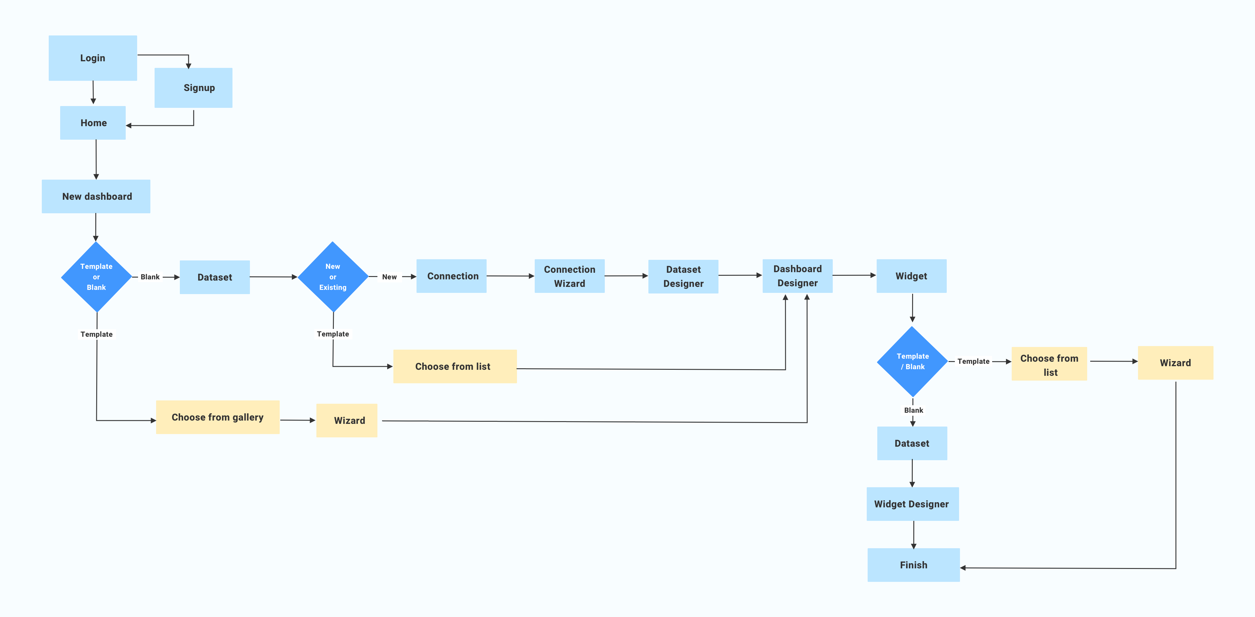
Step 10 - User flows
Next, I moved on to creating the user flows, looking at how each user would complete a critical task. the flows were made considering the fact that with the senior adult who has very low technical proficiency.
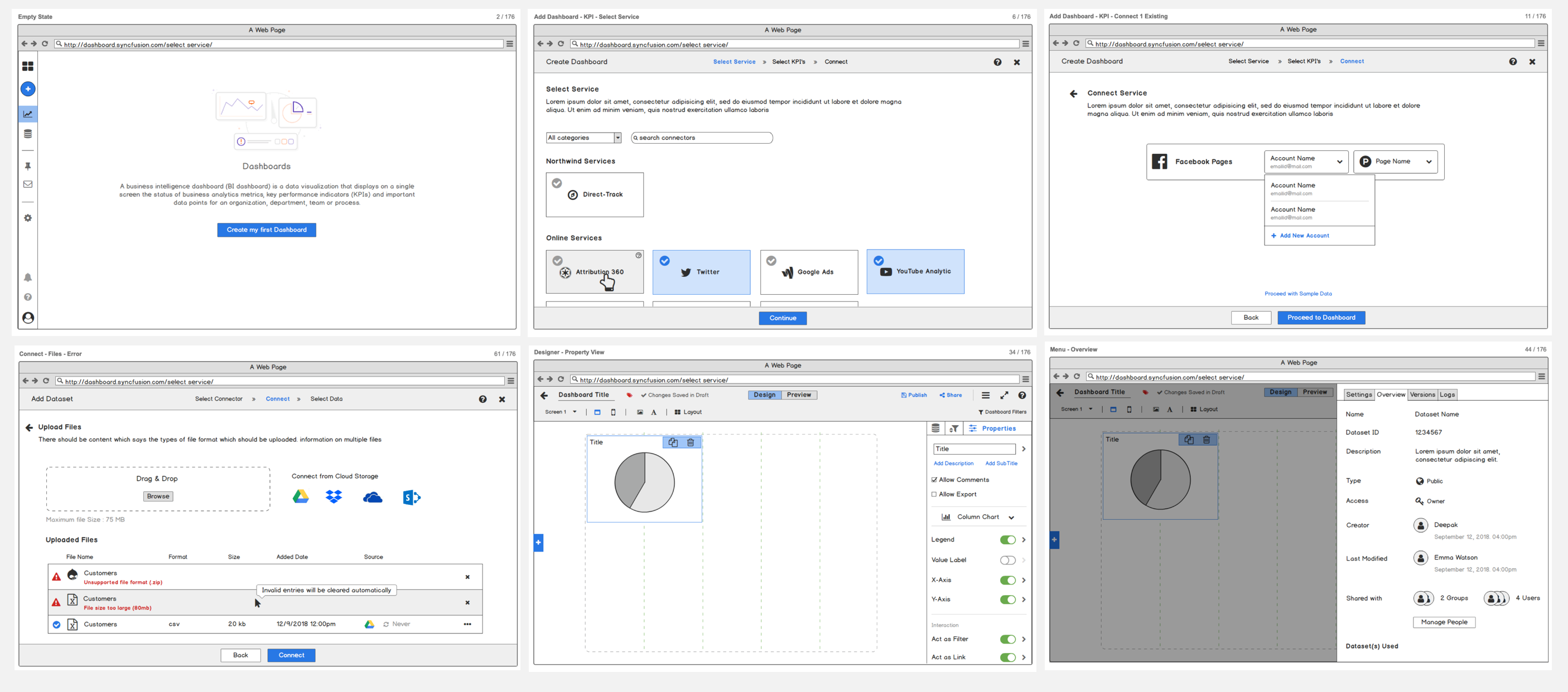
Step 11 - High fidelity wireframes
Using the information hierarchy, I created wireframes on paper. I tried to make them as detailed as possible to ensure that minimum changes needed to be done while I design mockups on Sketch.
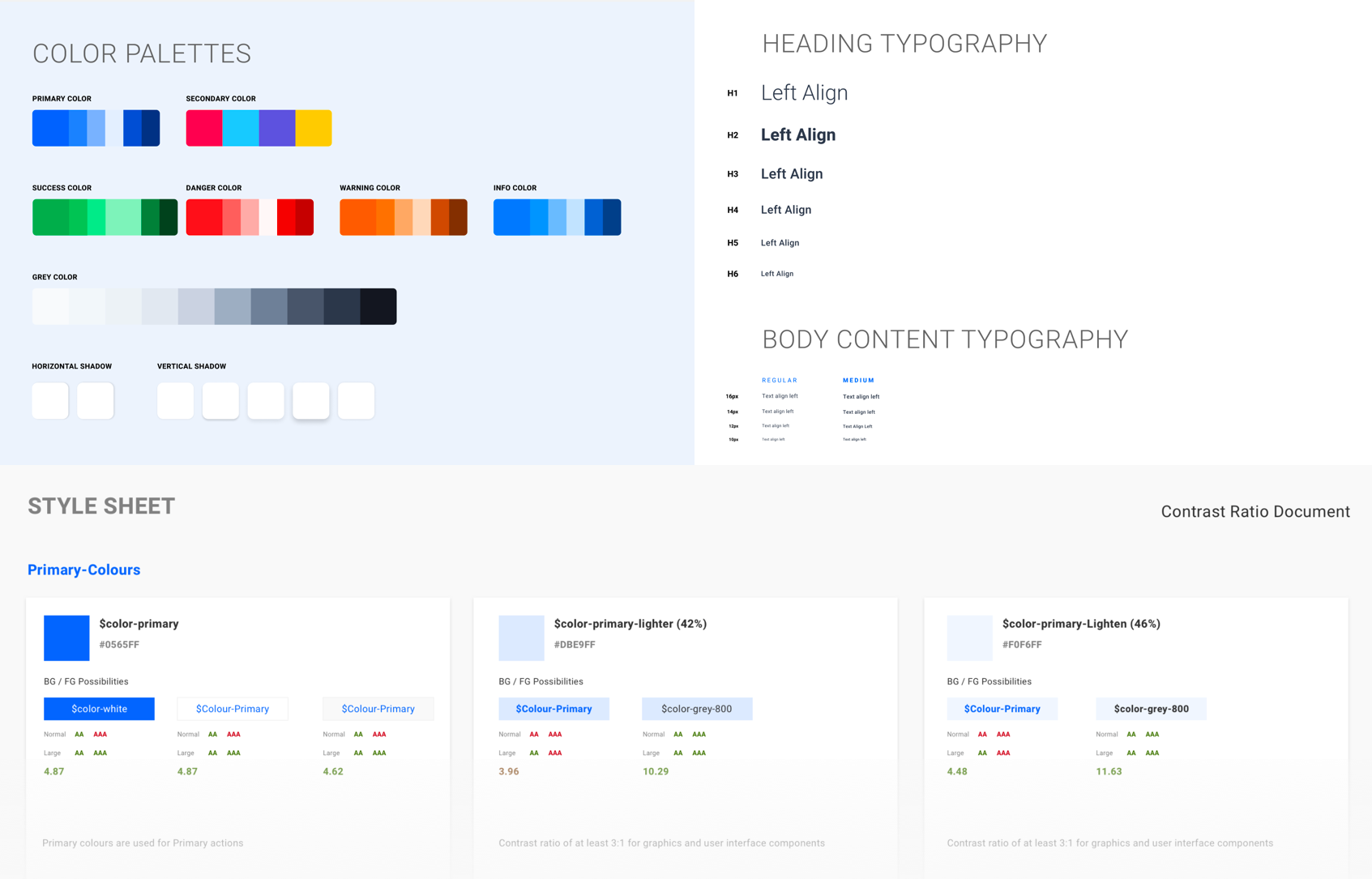
Step 12 - Style Guide
Before I start the visual design, I made up a product style guide along with the primary color which I rapidly mood-boarded for this process and for the product. I used SF Roboto, Because of the very good readability by its nature.
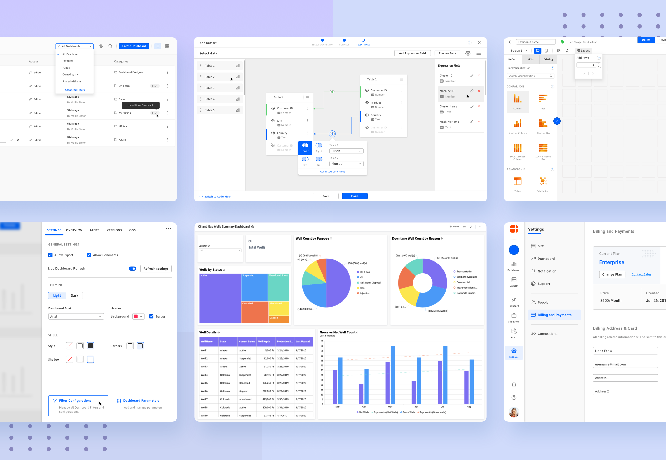
Step 13 - Visual Design
I gave the phone to two users with Sketch mirror And done some rapid basic user validation along with Assisbility, Along with the Sketch prototype, and observed how the user interacts with the interfaces. Through my observation, I can tell that susses rate of the product interaction is about 85%.
Step 14 - Interactions
With actual UI in place, we are defining live interactions with Principle tool. This will help the developer to understand the exact interaction needed, it could be a Micro Interaction for Icons & Components or page/screen Interactions for UI aesthetics.
Tools Used
•
Pen and Paper
•
Miro (for brain storming)
•
Adobe XD ( for Interaction )
•
Sketch (Visual design)
•
Balsamiq (for Wireframing)
Take Away
In this design challenge project, Brainstorming multiple times is very helpful to understand the user needs more clearly. I spent more time on brainstorming and user research than before for this project and I learned a lot about the senior adult and their specific needs.
