 2018 - 2019
Designing a seamless and powerful BI dashboarding solution from the ground up, combining intuitive user interfaces with robust data visualization tools to empower users and streamline decision-making.
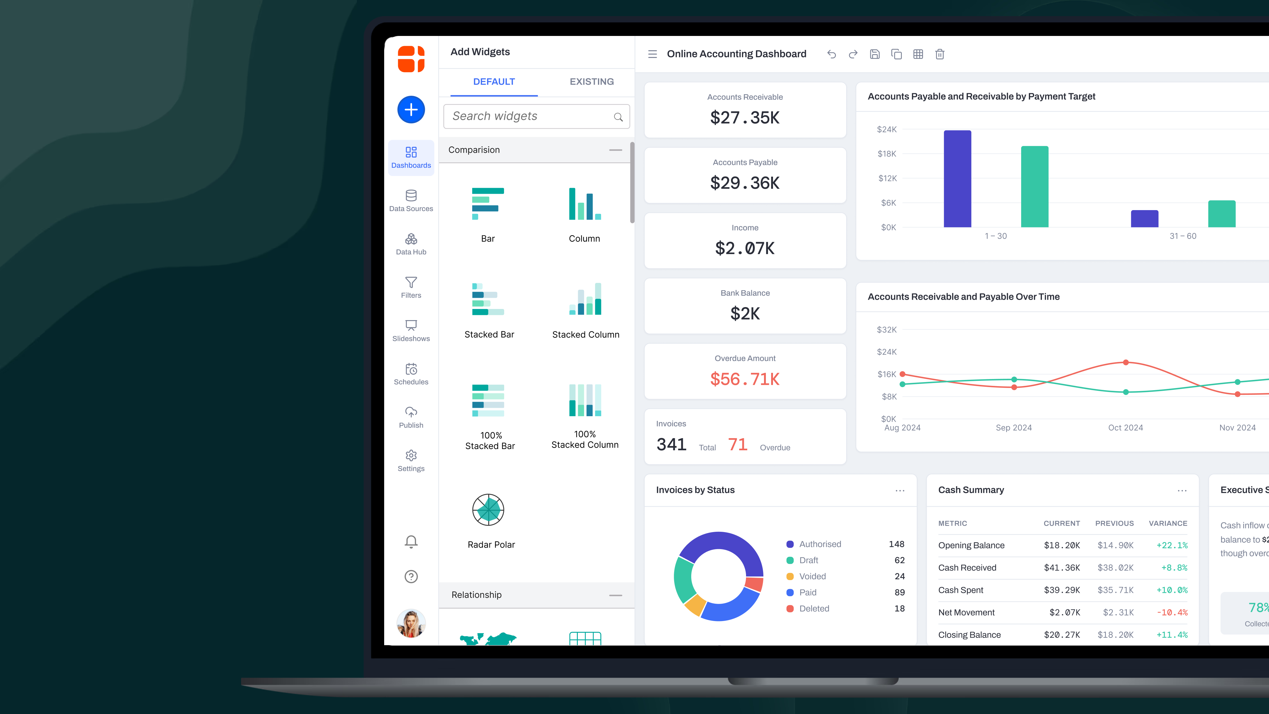
Overview
The goal of this project was to create a simple and intuitive BI dashboarding tool that empowers users to connect to any type of data source effortlessly and craft meaningful analytics visualizations. By focusing on usability and flexibility, the tool aimed to bridge the gap between complex data analysis and user accessibility. Comprehensive competitor analysis was conducted to identify gaps and opportunities within the market.
Goal
To design a self-service BI solution that simplifies data integration and visualization for end-users while offering the flexibility to cater to diverse data sources. My role was to lead the project from ideation to UI handoff, collaborating with a team of three designers to deliver a seamless and scalable design solution.
Mindmap Exploration
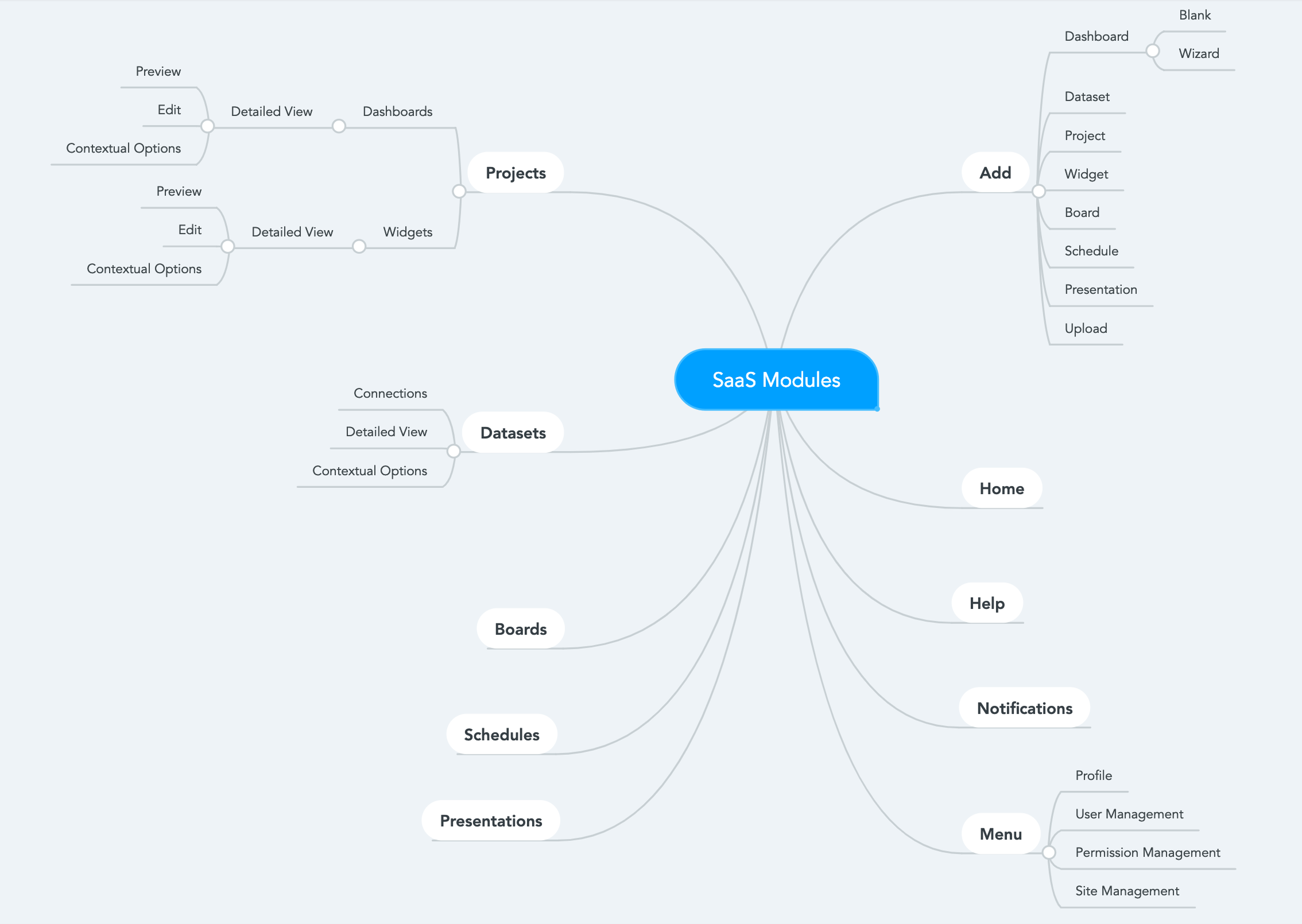
To kick off the project, we created detailed mindmaps to structure our thoughts and uncover user needs. These mindmaps helped us break down the complexity of BI tools into simpler, user-focused components. Key aspects included:
- User Journey Mapping: — Identifying steps users take to connect data sources and build dashboards.
- Feature Prioritization: — Highlighting essential features such as data source integration, widget customization, and visualization templates.
- Pain Point Analysis: — Understanding challenges users face with existing BI solutions, like steep learning curves and limited customization.
These mindmaps acted as the blueprint for aligning the team on the project’s direction and ensuring a holistic, user-centered approach.
Workflow Design
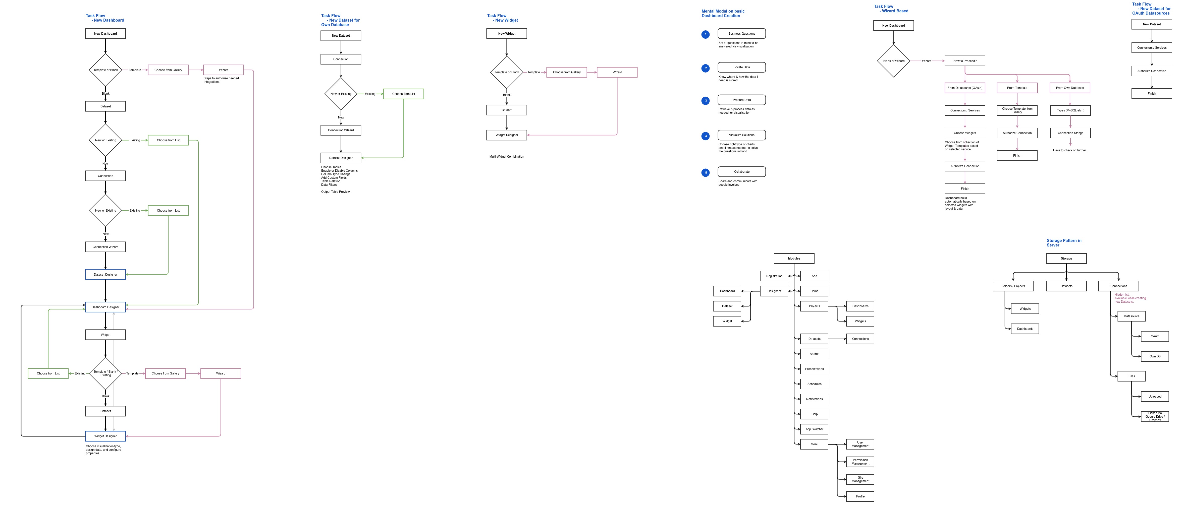
To ensure a seamless user experience, we meticulously designed workflows that guided users through the process of connecting data and building visualizations. Key workflows included:
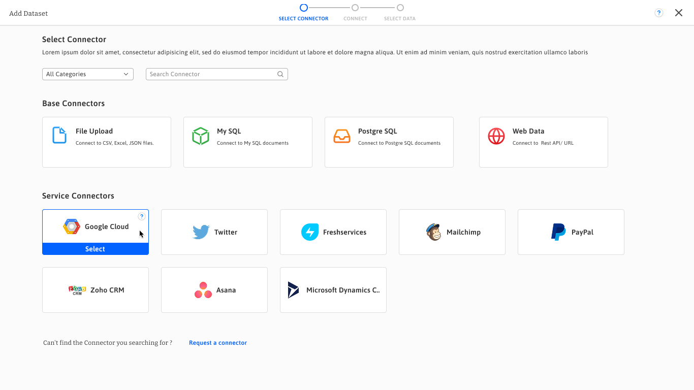
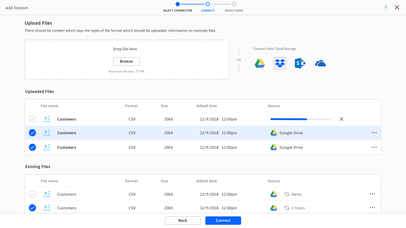
- Data Connection Workflow: — A step-by-step process enabling users to self-connect to various data sources such as SQL databases, cloud storage, and APIs effortlessly.
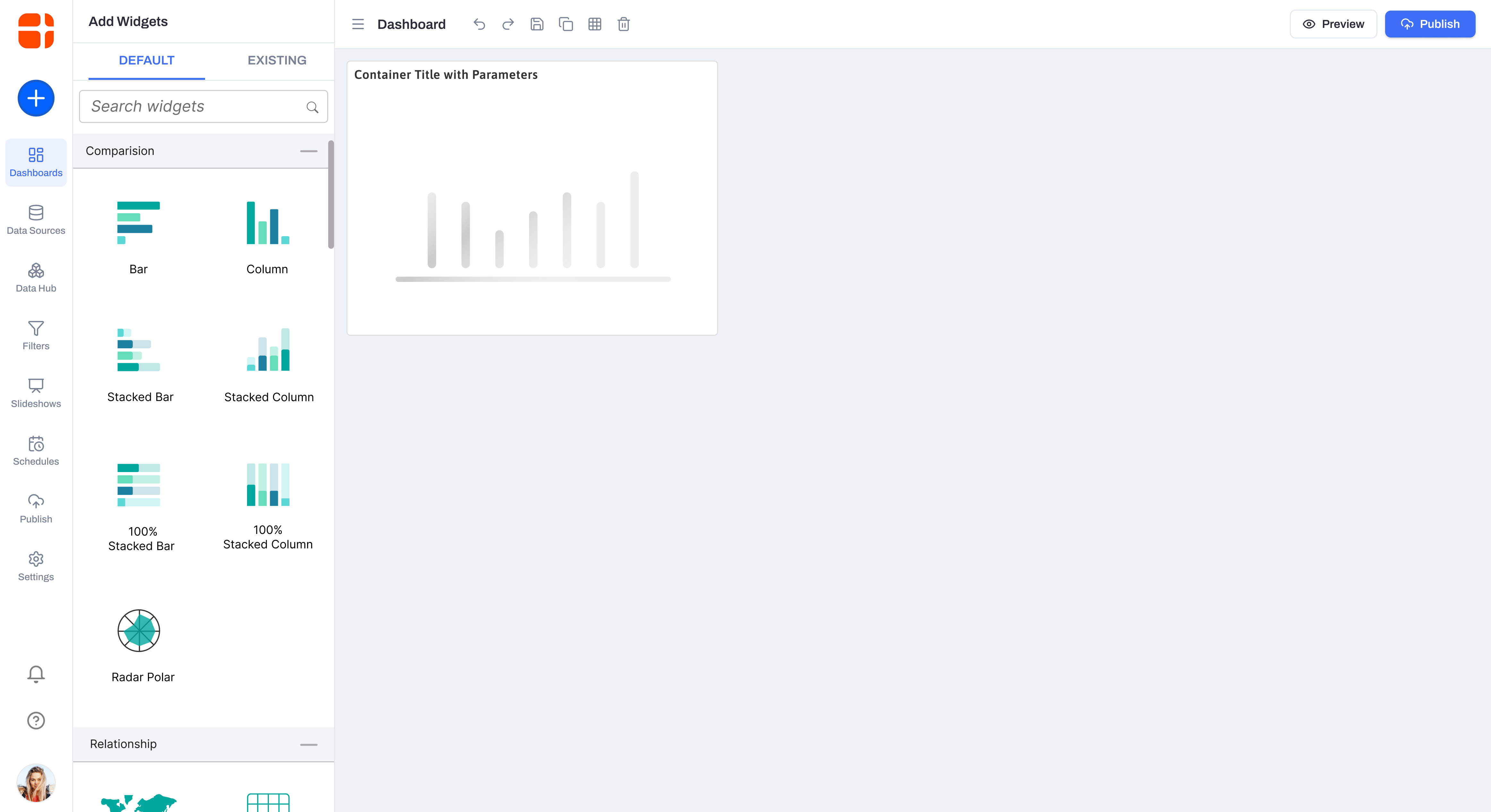
- Dashboard Creation Workflow: — Streamlined steps for selecting visualization types, customizing layouts, and adding widgets with drag-and-drop functionality.
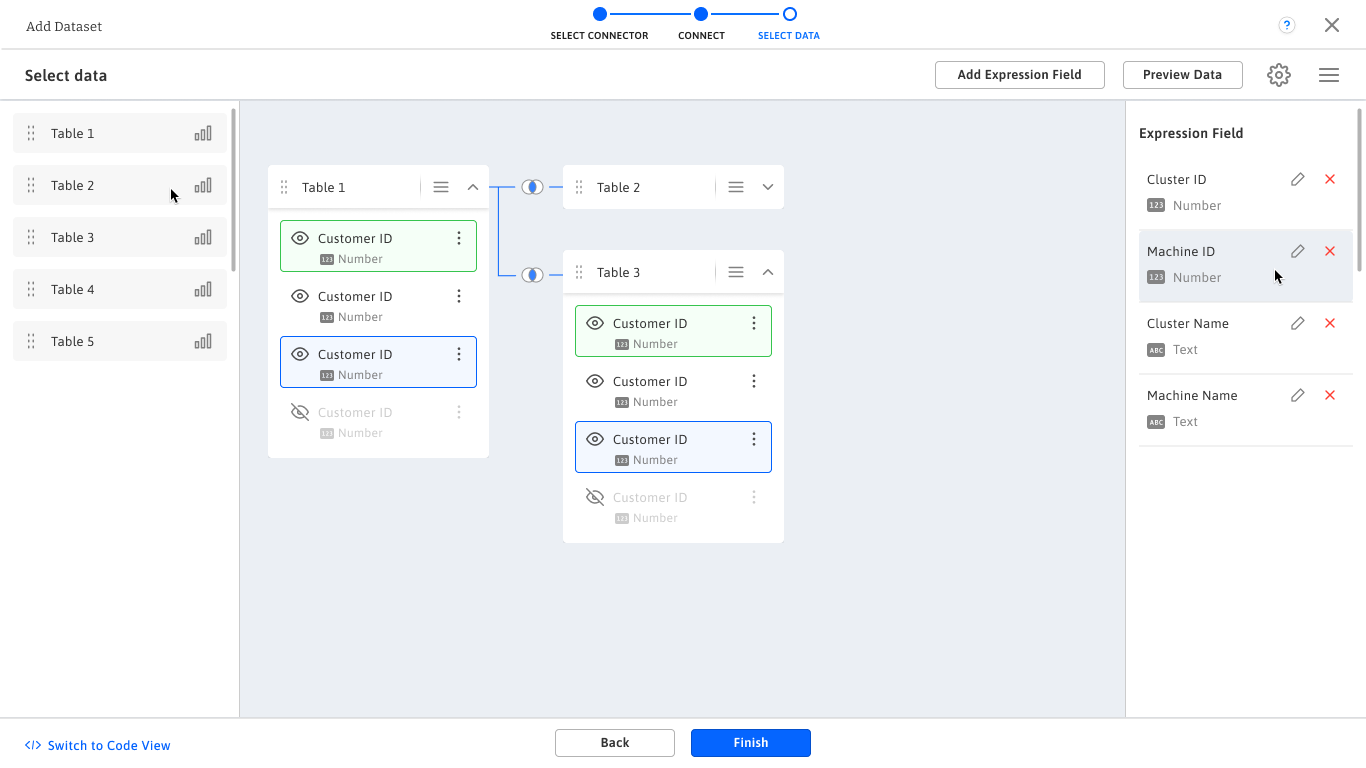
- Data Transformation Workflow: — Simplified options for filtering, grouping, and transforming data within the interface, making advanced analytics accessible to all users.
Each workflow was validated through iterative testing and feedback to ensure efficiency and ease of use, aligning with our goal of creating an intuitive BI tool.
Whiteboarding Sessions
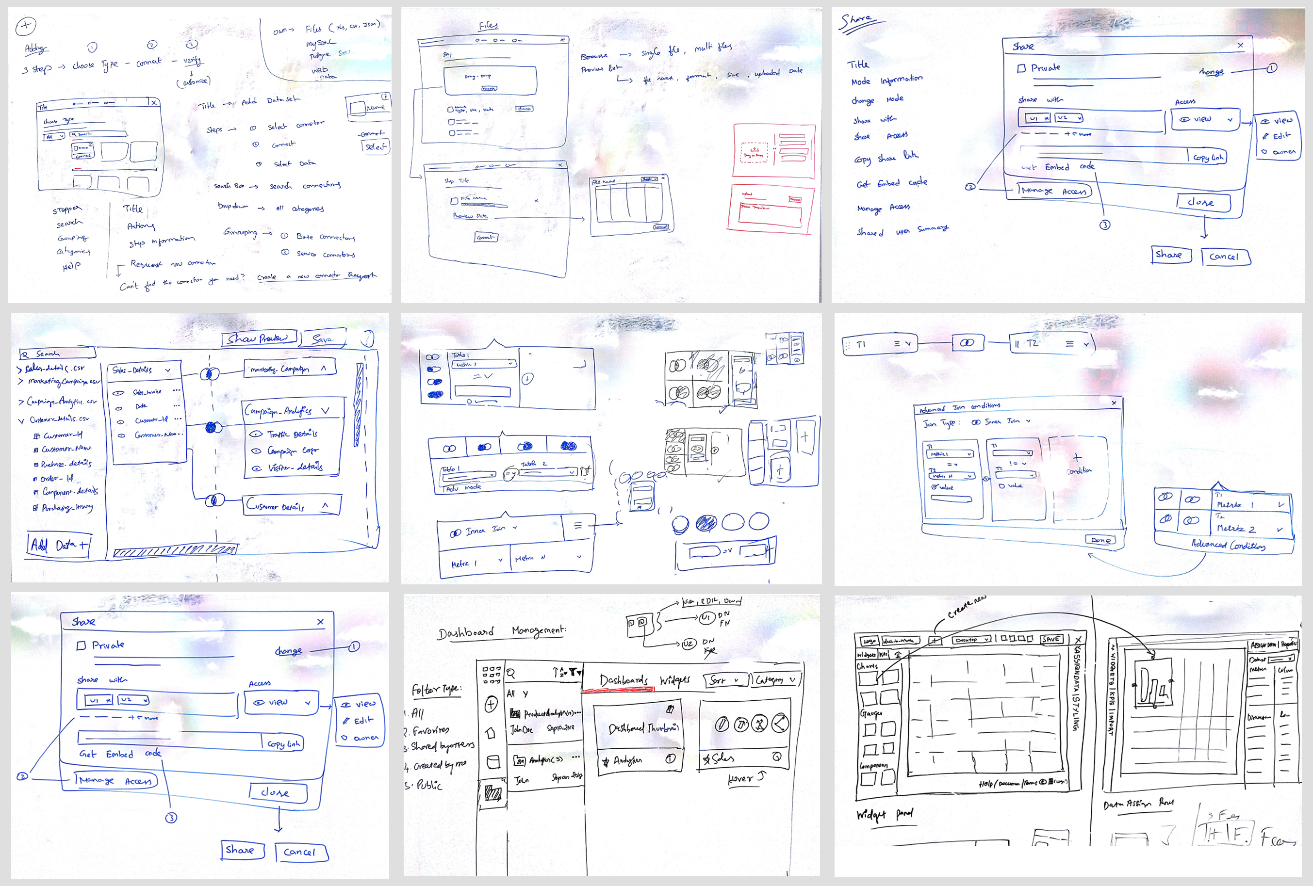
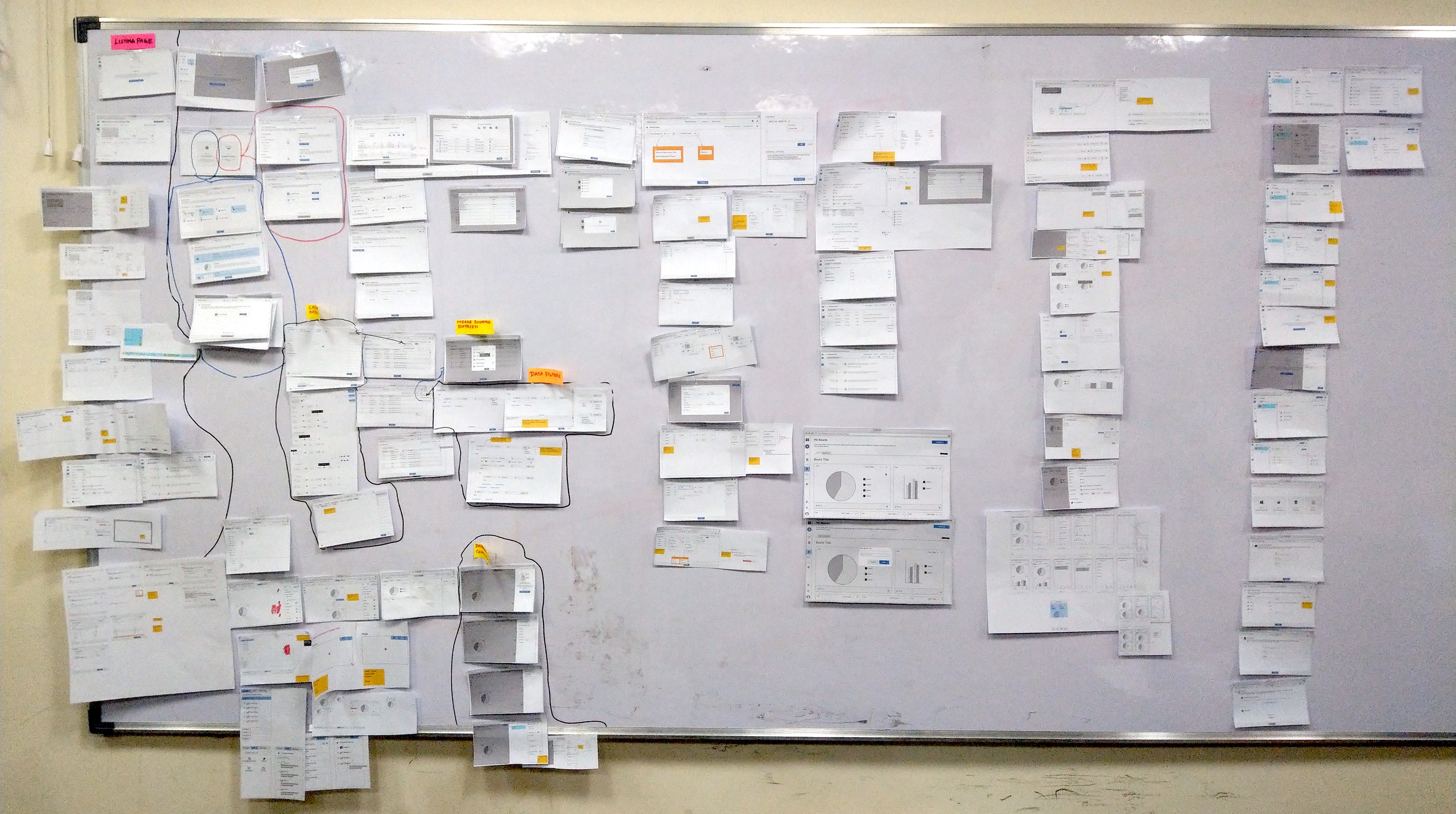
Whiteboarding played a pivotal role in brainstorming and refining the design approach. During these sessions, the team collaborated to visualize concepts, map user journeys, and identify potential challenges early in the process. Key outcomes included:
- Layout Exploration: — Experimented with dashboard layouts to balance simplicity and functionality, ensuring users could focus on their data without clutter.
- Feature Mapping: — Sketched out core features like drag-and-drop widgets, data source integration, and real-time visualization updates.
- Problem Solving: — Addressed pain points identified during competitor analysis, such as confusing navigation and limited customization options.
Each workflow was validated through iterative testing and feedback to ensure efficiency and ease of use, aligning with our goal of creating an intuitive BI tool.
Wireframes
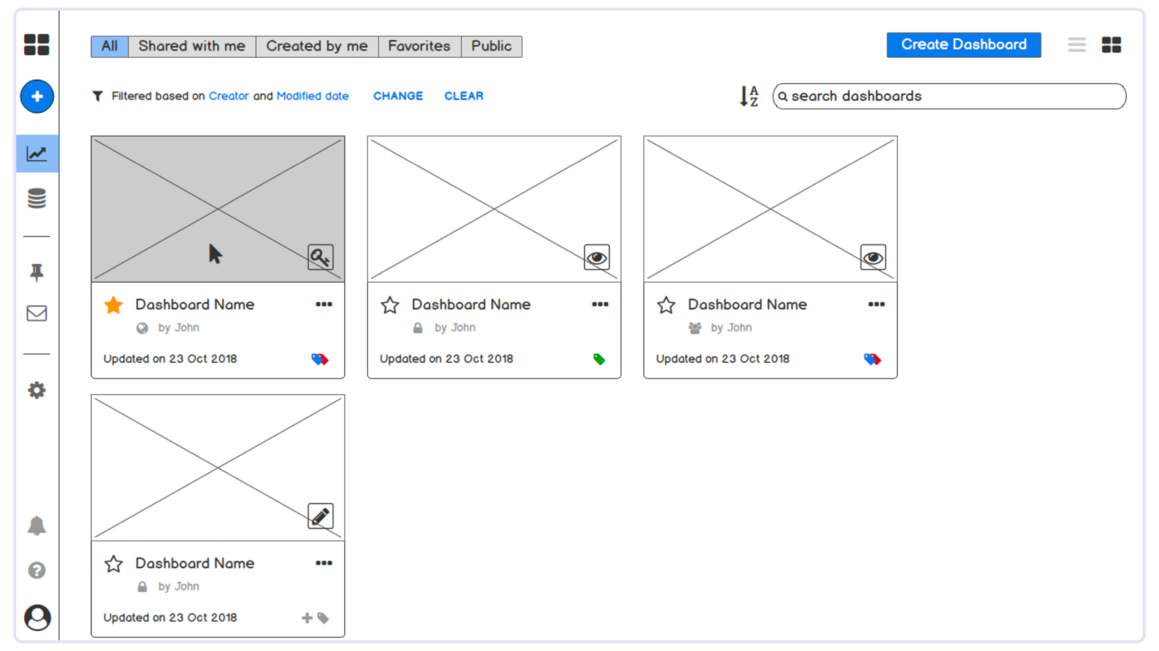
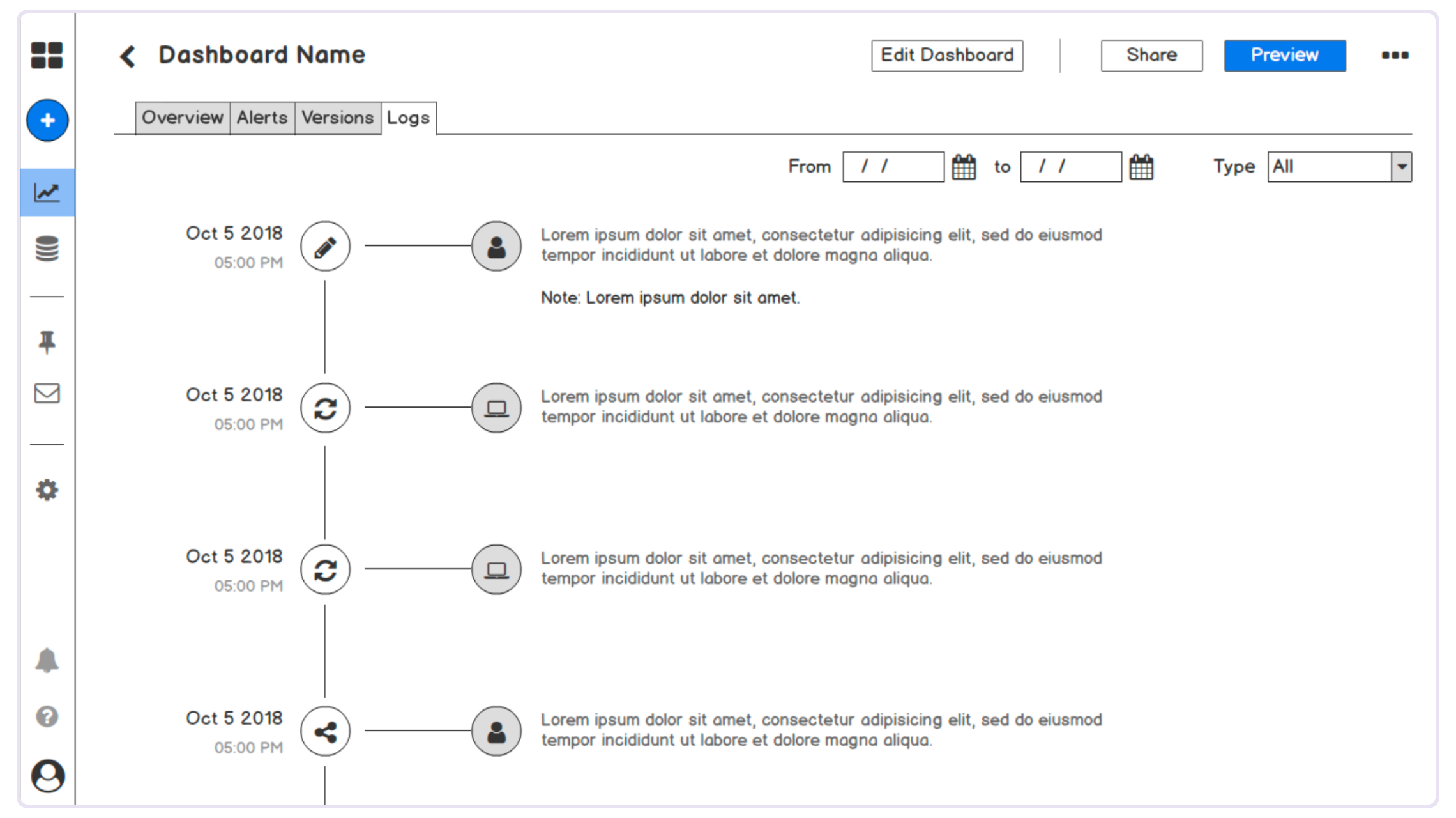
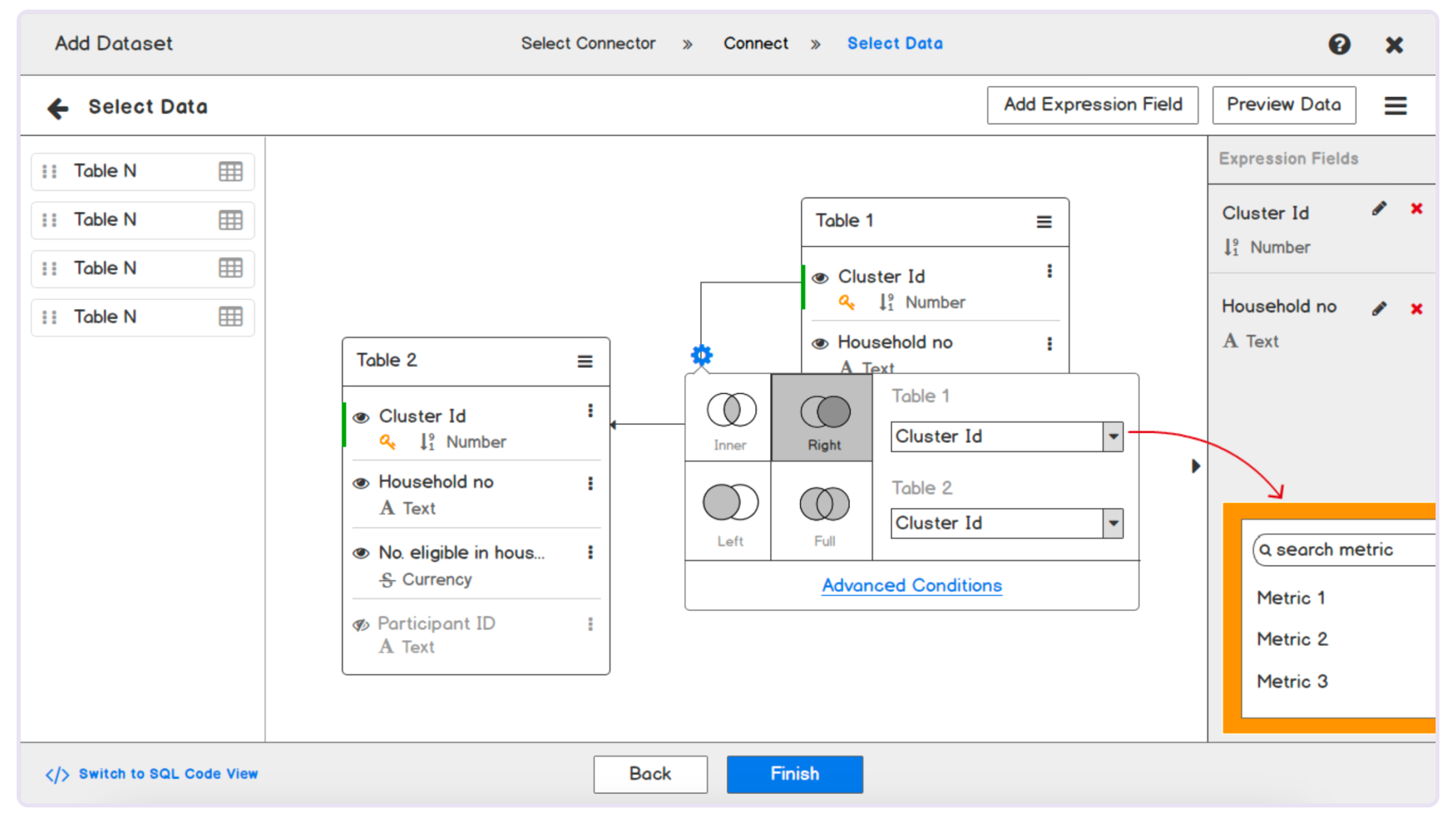
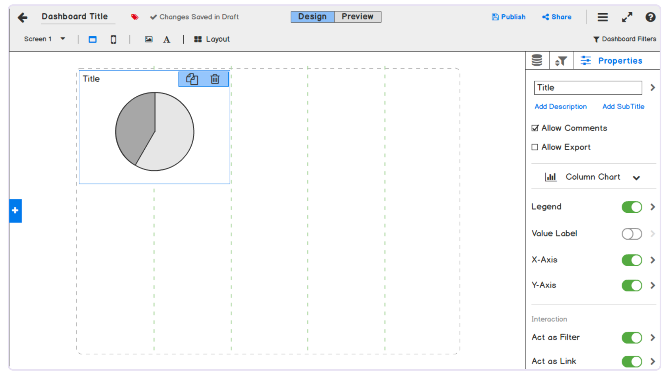
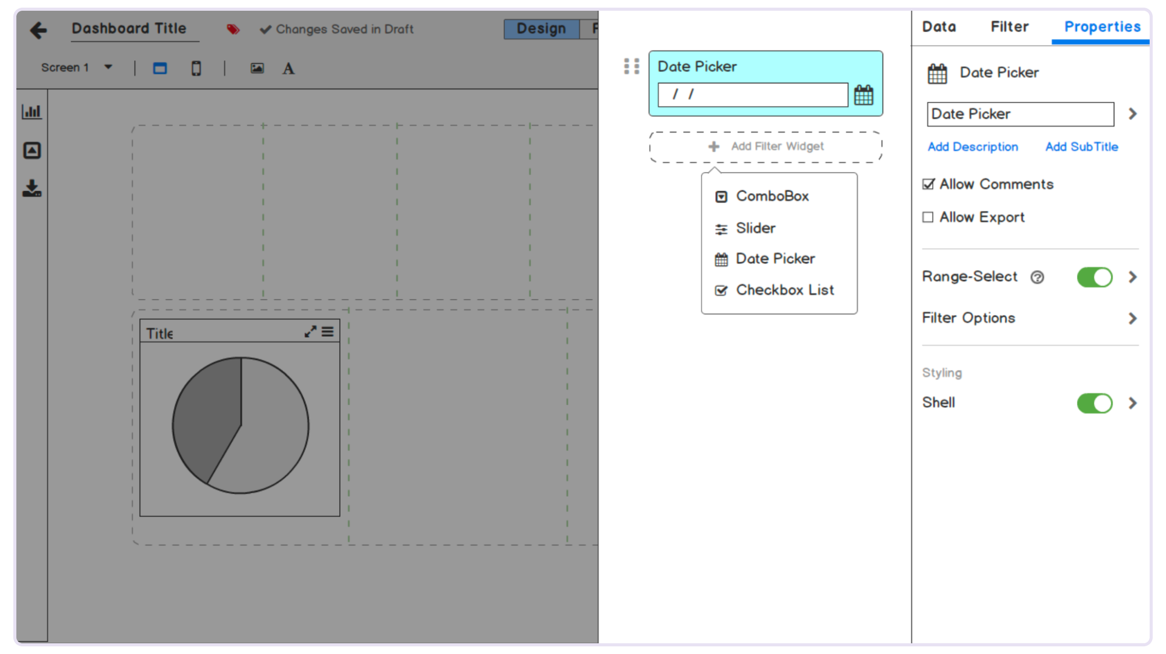
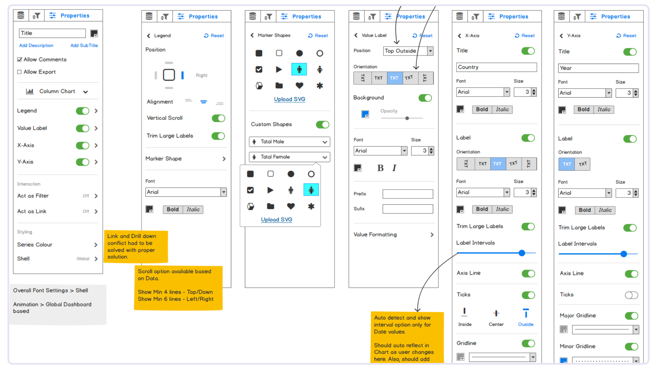
Wireframing was a critical step in translating sketches into structured, functional designs. This phase focused on defining the layout, hierarchy, and interactions of the BI dashboard. Key highlights include:
Design System
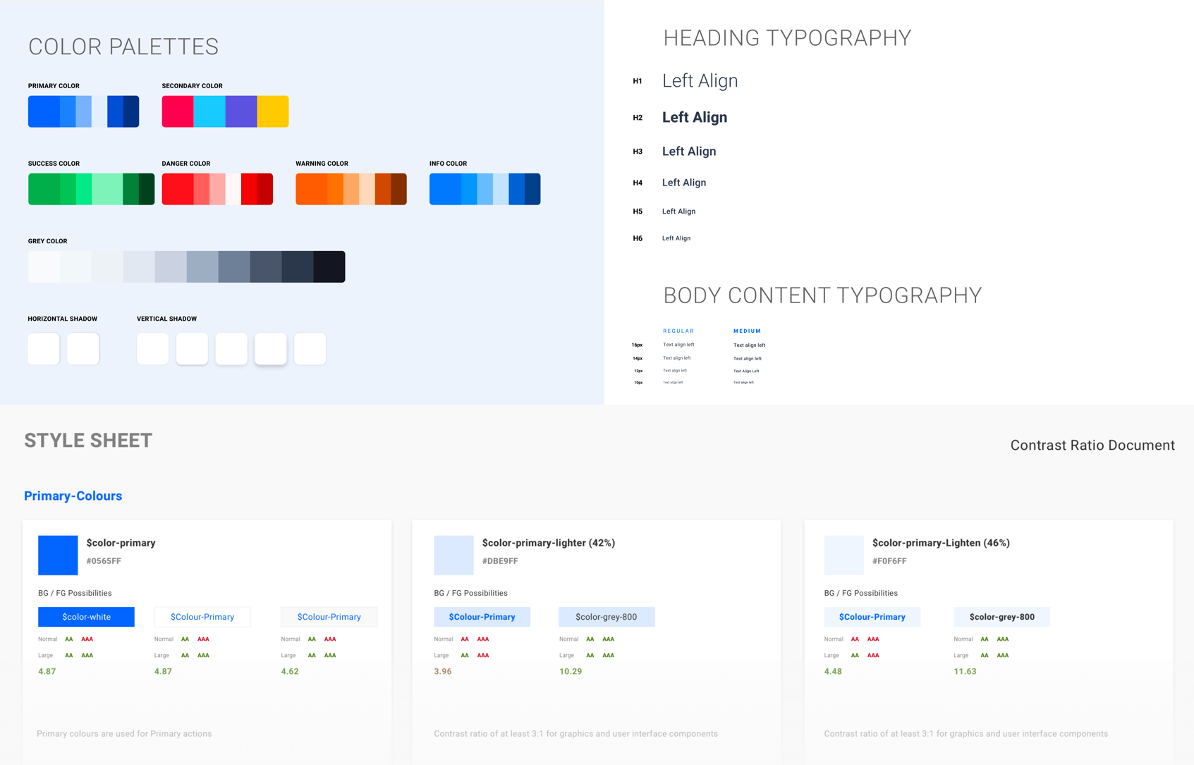
The design system became the foundation for building consistent, scalable experiences across the product. I established the core foundations—including color tokens, an eight-level grayscale, semantic palettes for success, warning, danger, and information, a comprehensive typography scale, spacing, and elevation—and documented everything as engineering-ready specifications rather than static style guides.
Visual Design
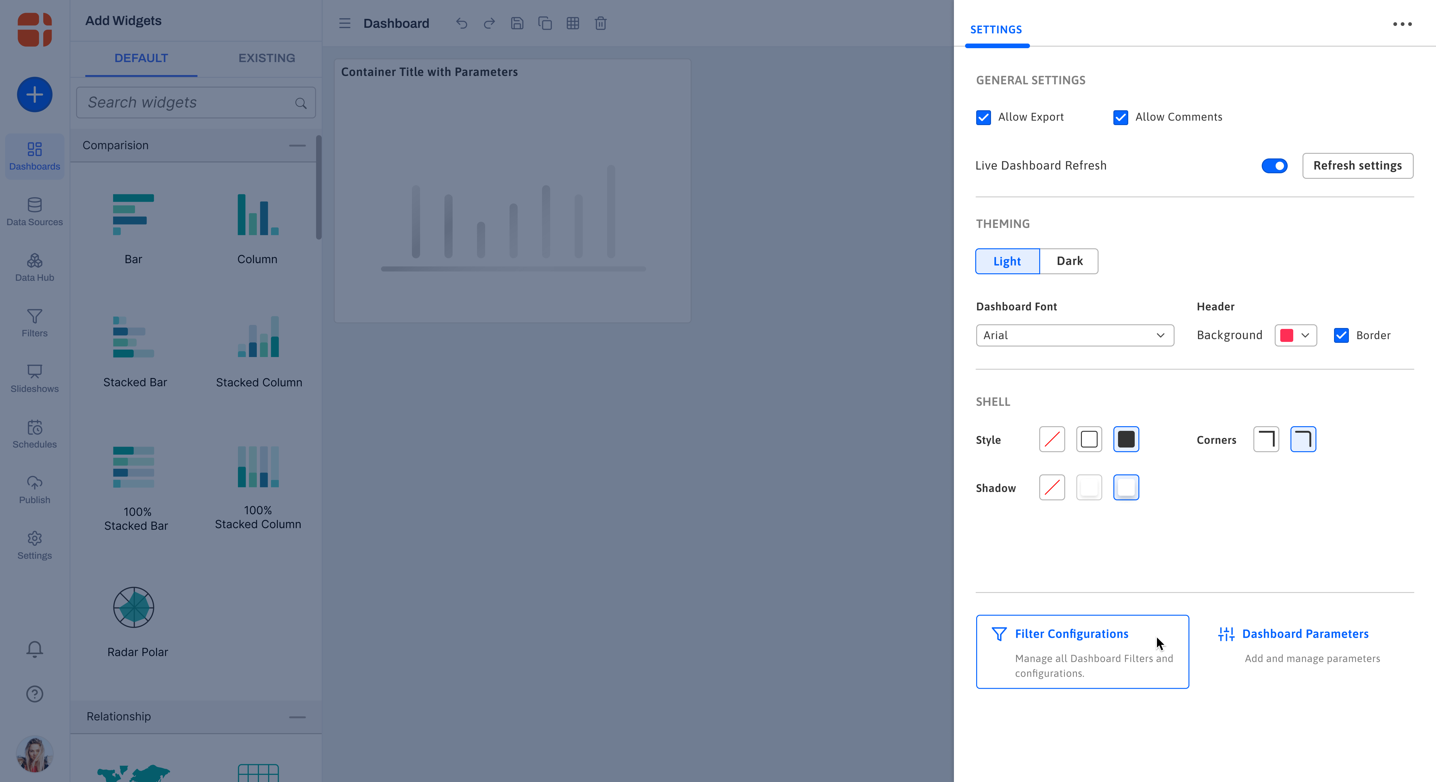
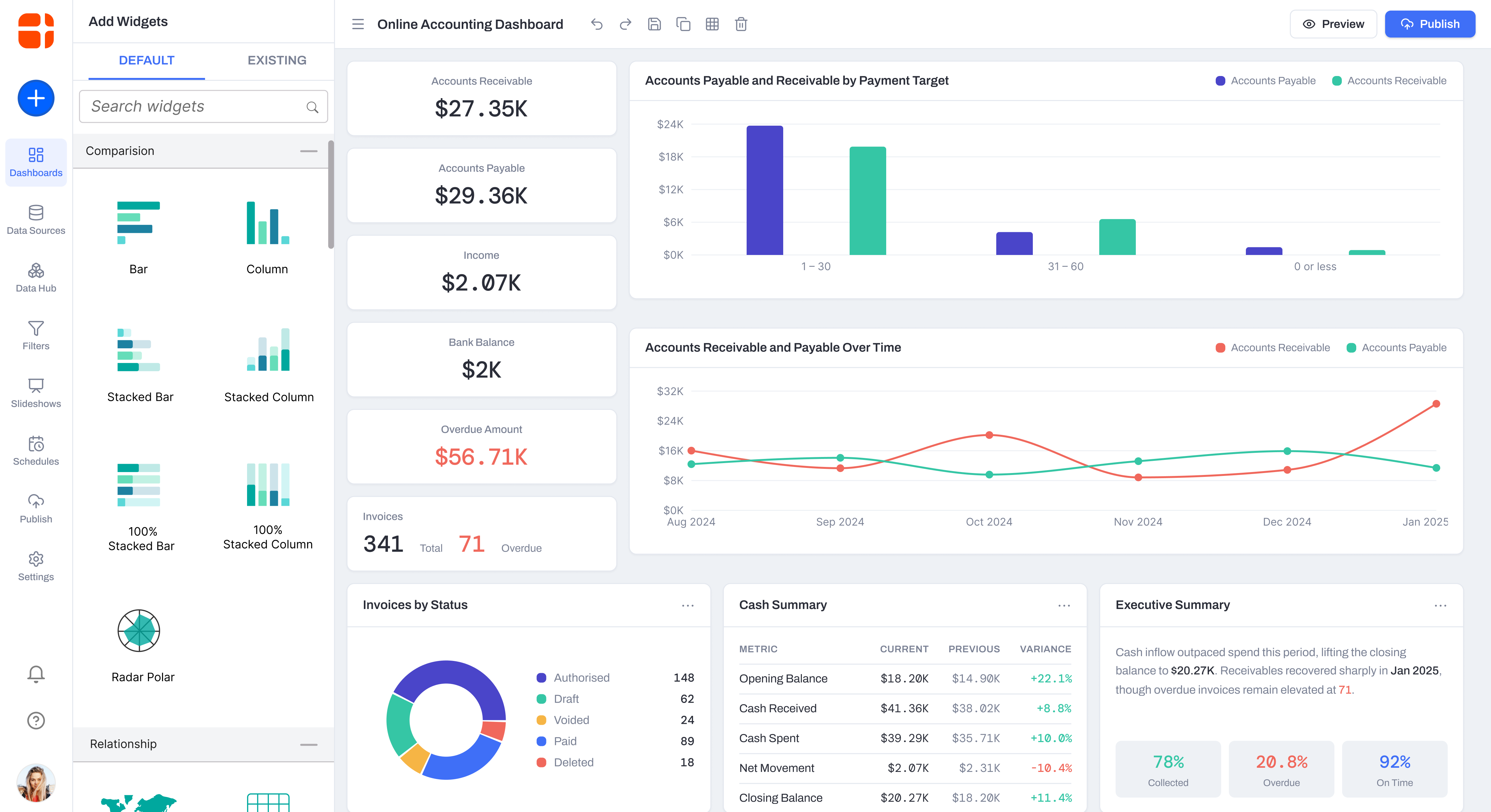
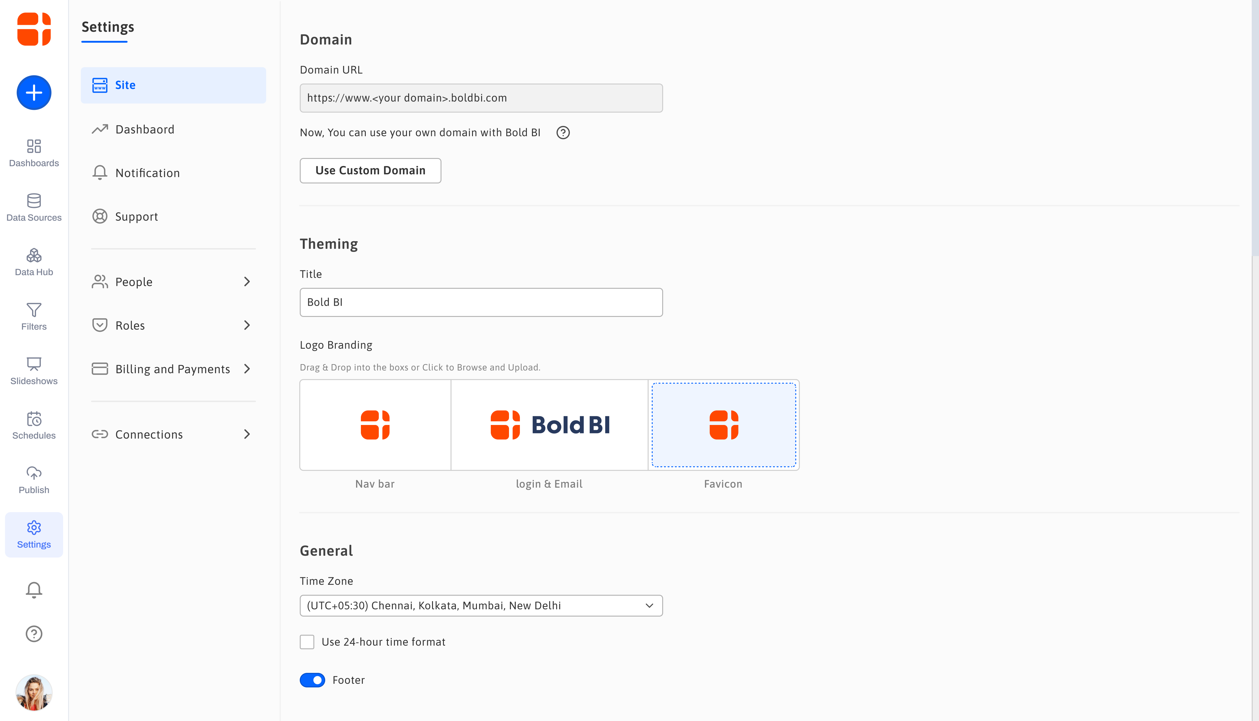
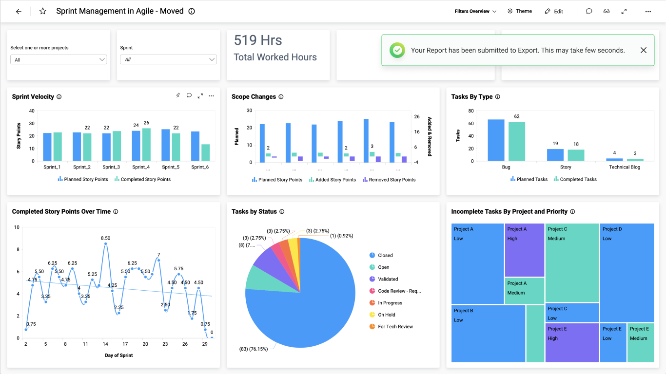
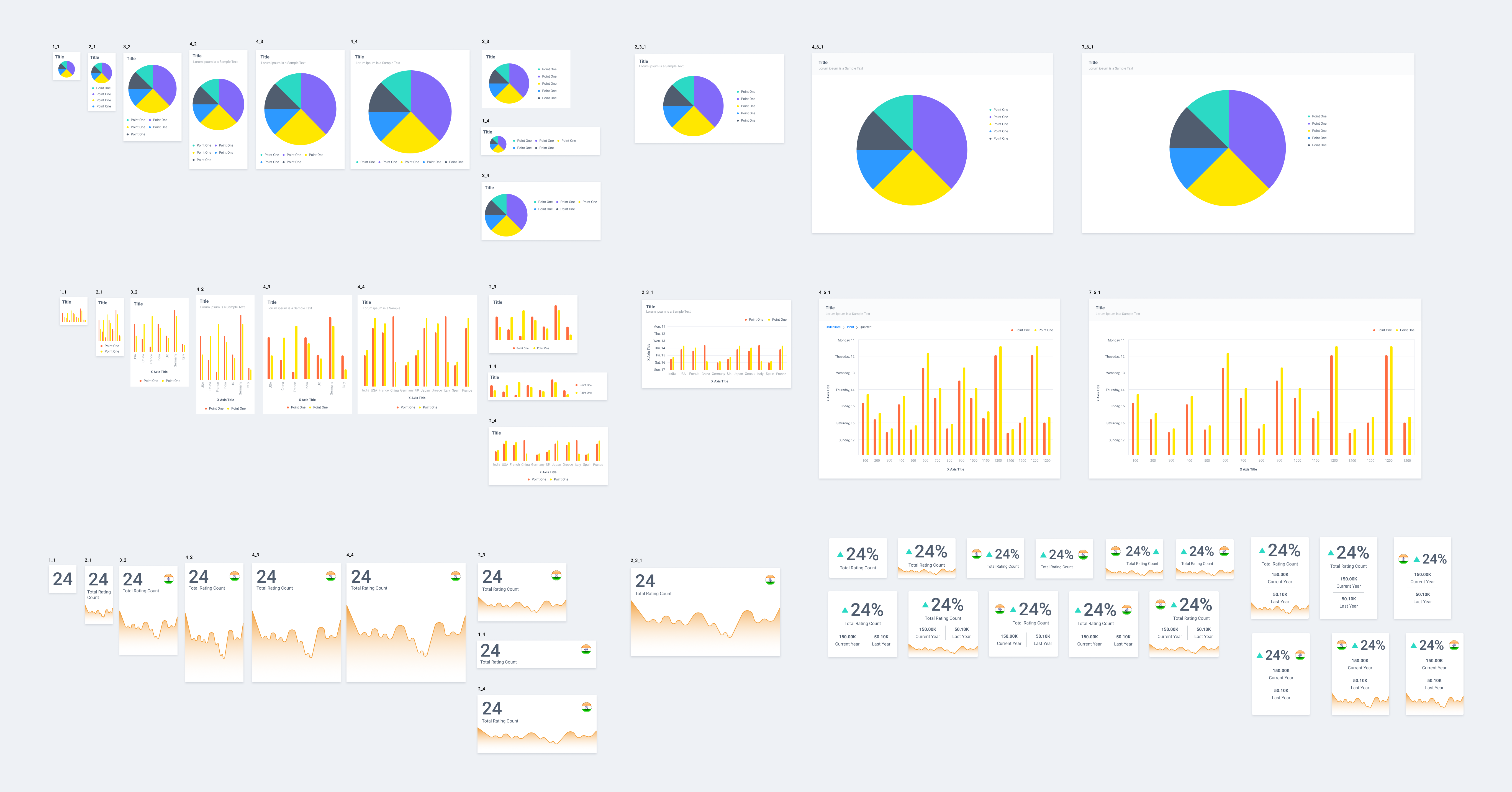
The visual design phase focused on transforming validated wireframes into a polished, intuitive interface that made complex analytics feel approachable. Every screen was refined with clarity, consistency, and scalability in mind, ensuring users could navigate large datasets, configure dashboards, and interpret insights without unnecessary cognitive load.
- Clear Visual Hierarchy: — Established typography, spacing, and color contrast to guide attention toward critical data and actions.
- Dashboard-first Experience: — Designed layouts that balanced dense information with readability, allowing users to scan and understand insights quickly.
- Responsive & Accessible UI: — Ensured the interface adapted across screen sizes while following accessibility best practices for contrast, spacing, and interaction.
Results & Impact
- Enhanced Usability — Streamlined interface leading to higher engagement.
- Strategic Insights — Competitive analysis informed smart UX decisions.
- Iterative Improvement — Continuous refinement based on user feedback, ensuring long-term satisfaction.